Data Visualization · UI Strategy

Cross-platform

2019–2022

how i

MADE COMPLEX ENERGY DATA READABLE IN 3D

ROLE

Lead Product Designer

TEAM COMPOSITION

1 Product designer · 1 UX · 1 frontdev

ORGANIZATION

Start up

PRODUCT TYPE

B2B2C

Greencom Networks was a scale-up with five SaaS products.
I was the founding designer, working across the entire product line.

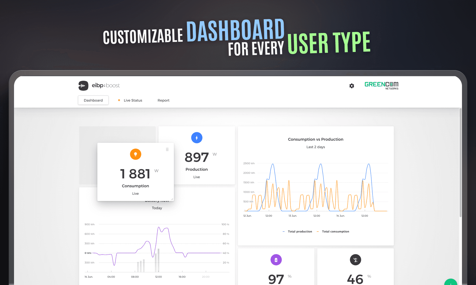
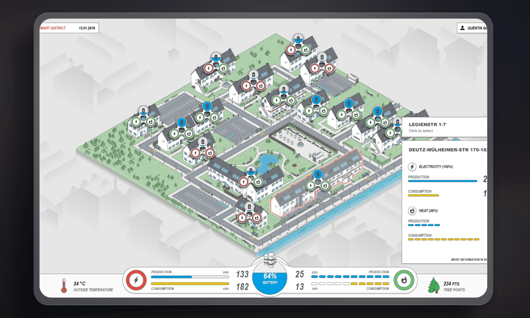
The flagship product was a home energy management app designed to help users understand their energy flows.

In 2019, I redesigned the energy data visualization end to end.
There was no solid user research.
No reliable metrics.

The goal was clear:
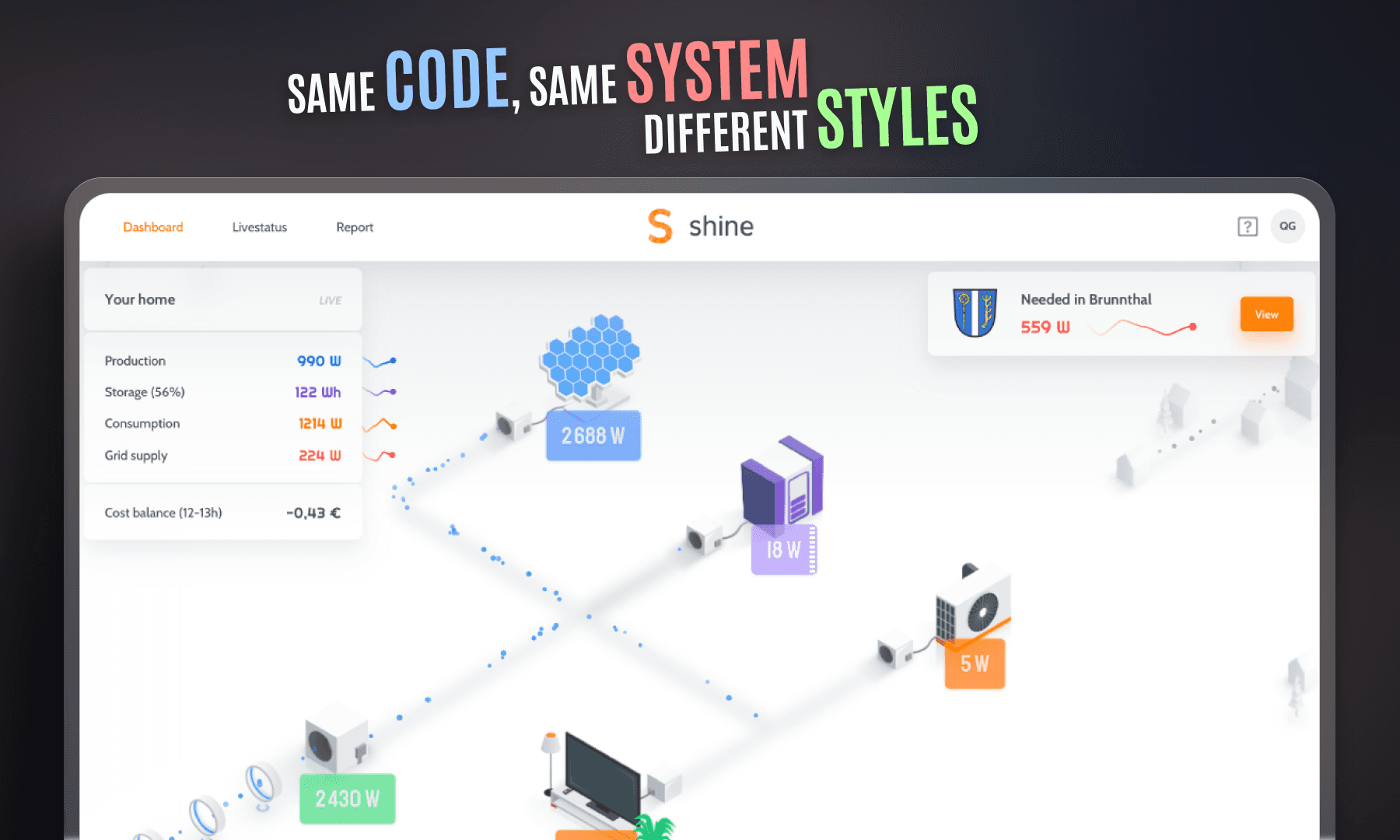
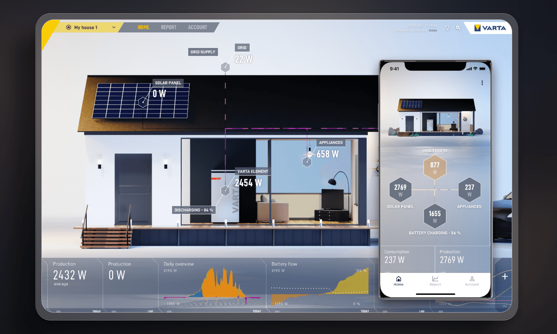
turn the product into a white-label web app that large solar and battery companies could customize and resell.

How it started

Sales Manager
Sales Manager
09:02
Client demo in 30 min. They want to understand the full energy flow — production to grid.
Product Manager
Product Manager
09:03
Can the product explain that by itself?
Frontend Developer
Frontend Developer
09:04
We show all the data. Production, consumption, battery, grid. It’s technically complete.
Product Manager
Product Manager
09:05
Right now, it still needs a guided tour during the demo.
⚠️1
Sales Manager
Sales Manager
09:06
Yeah. If I stop talking, the story stops too.
Frontend Developer
Frontend Developer
09:07
From a system point of view, everything behaves correctly.
Product Manager
Product Manager
09:08
That’s the issue. It’s correct — but not readable. And we can’t scale demos like that anymore.

How I approached it

Listen to non-user signals

Before …

There were no analytics.
No direct user feedback.

We were flying blind. No clear data to validate direction.

I looked elsewhere.

  • Sales demos that required constant explanation.

  • Long onboarding sessions.

  • Features used in unexpected ways.

I treated those signals as data.
Pain points became opportunities.

… after

We gained clarity on where the real problem lived.

The solution became easier to define.
Because the problem finally made sense.

Listen to non-user signals

Before …

There were no analytics.
No direct user feedback.

We were flying blind. No clear data to validate direction.

I looked elsewhere.

  • Sales demos that required constant explanation.

  • Long onboarding sessions.

  • Features used in unexpected ways.

I treated those signals as data.
Pain points became opportunities.

We gained clarity on where the real problem lived.

The solution became easier to define.
Because the problem finally made sense.

… after

Design 3D as a reading aid, not a visual effect

Before …

  • Standard 2D charts were considered a safer option.

  • There was a real risk of fragmenting the product per client.

  • Maintaining multiple UI versions was a concern.

We treated 3D as a language.

  • Depth to express hierarchy.

  • Motion to explain relationships.

  • Camera and perspective to guide attention.

Every visual choice had to answer one question:
does this make the data easier to read?

… After

The interface started explaining itself.

Users needed fewer explanations. Energy flows became easier to follow.

Design 3D as a reading aid, not a visual effect

Before …

  • Standard 2D charts were considered a safer option.

  • There was a real risk of fragmenting the product per client.

  • Maintaining multiple UI versions was a concern.

We treated 3D as a language.

  • Depth to express hierarchy.

  • Motion to explain relationships.

  • Camera and perspective to guide attention.

Every visual choice had to answer one question:
does this make the data easier to read?

The interface started explaining itself.

Users needed fewer explanations. Energy flows became easier to follow.

… After

Design a single-screen energy overview

Before …

Energy data lived across multiple expert dashboards.

Understanding flows meant switching contexts.
Non-experts got lost quickly.

Even simple questions required navigation.

We collapsed everything into one view:
One isometric scene showing production, storage, consumption, and grid.

All states visible at once.

… After

Energy flows were understood in seconds.

Demos required fewer explanations.
The same interface worked for both B2C and B2B audiences.

Design a single-screen energy overview

Before …

Energy data lived across multiple expert dashboards.

Understanding flows meant switching contexts.
Non-experts got lost quickly.

Even simple questions required navigation.

We collapsed everything into one view:
One isometric scene showing production, storage, consumption, and grid.

All states visible at once.

Energy flows were understood in seconds.

Demos required fewer explanations.
The same interface worked for both B2C and B2B audiences.

… After

What it actually changed

MAJOR IMPACTS

Before

After

Technical 2D dashboards

Single animated 3D energy view

Long verbal explanations

Visual explanation in minutes

Generic energy platforms

Recognizable product identity

Low sales conversion

UI-driven sales conversations

Before

After

Technical 2D dashboards

Single animated 3D energy view

Long verbal explanations

Visual explanation in minutes

Generic energy platforms

Recognizable product identity

Low sales conversion

UI-driven sales conversations

Before

After

Technical 2D dashboards

Single animated 3D energy view

Long verbal explanations

Visual explanation in minutes

Generic energy platforms

Recognizable product identity

Low sales conversion

UI-driven sales conversations

-0%

-0%

Navigation depth

x0

x0

New clients in 12 months

Organizational impacts

Sales stopped relying on slides and long explanations.
The product became the pitch.

Design changed status.
It was no longer something added at the end, but a lever used early to shape strategy and differentiation.

Frontend teams felt the shift as well.
Building complex UI systems stopped being risky or improvised.
It became something they could deliver with confidence.

White-label customization followed the same path.
What used to be fragile and expensive to maintain became predictable.
And finally, sustainable.

Retrospective

Treating the 3D view as a system, not a screen, changed everything.
It allowed strong visual differentiation without fragmenting the product.

That shift also clarified what really mattered:
structure first, visuals second.

In hindsight, one thing would change.
Engineering would be involved earlier in visual exploration.

Not to execute faster,
but to shape the system together from the start.

TL;DR

Faster understanding

One view was enough to understand

Sales acceleration

4 times more sales after launch

Clear differentiation

A new data vizualisation in the industry

TL;DR

Faster understanding

One view was enough to understand

Sales acceleration

4 times more sales after launch

Clear differentiation

A new data vizualisation in the industry