01
Friction
For energy traders
They had to quickly answer a simple question: how much energy can we use now or soon?
Fast decision
Variable availability
Trust required

In 2019, we were working on a tool that helped energy suppliers manage batteries, solar panels and other distributed assets across the grid. Energy traders struggled to quickly know how much energy was available, where it was located and how long it could be used — I designed an interface to make those answers visible and test a power demand.
Challenge
My role
OwnedContributedYear
Timeline
Tools
Before: an asset list useful for browsing, but insufficient for making quick decisions.
Methodology
Time needed to find
Available
power
Available prod or
storage units
Risk to
local comfort
Key answers required too much manual search.
Data existed but answers didn't
Traders could see assets, but not directly the energy actually usable
Trading scenarios
Answers obtained without interaction
1/10Without filtering, calculating or cross-referencing outside the tool.
Answers requiring manual analysis
7/10Comparison, forecasting or estimation outside the tool.
The list displayed data, but not answers.
How can we help a trader quickly know how much energy can be used, where, and for how long?
01
Friction
For energy traders
They had to quickly answer a simple question: how much energy can we use now or soon?
Fast decision
Variable availability
Trust required
02
Friction
For energy providers
Thousands of distributed assets had to become a readable and usable reserve.
Distributed assets
Hard to aggregate potential
Local comfort to preserve
Create a filtered list view
Add filters, statuses and key columns to find available assets faster.
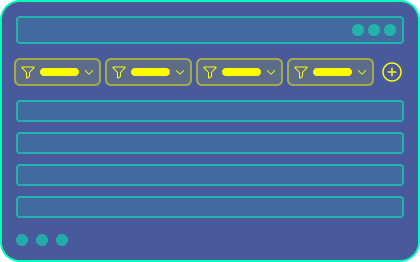
Quick to ship
Familiar usage
Answer still to reassemble
Decision still slow
Create a geographic view
Display assets on a map to understand where available energy is located.
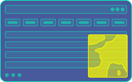
Clear localisation
More readable portfolio
Observation view only
No simulation
Create a decision view
Combine map, capacity, forecast, local risk and simulation in a single interface.
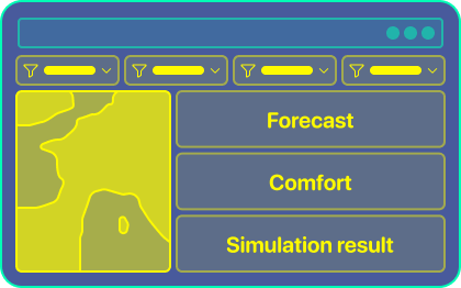
Immediate answer
Testable action
More complex
Thresholds to explain
Check out the 4 key decisions I made
Readability
The list displayed assets, but the interface had to directly answer the decision questions.
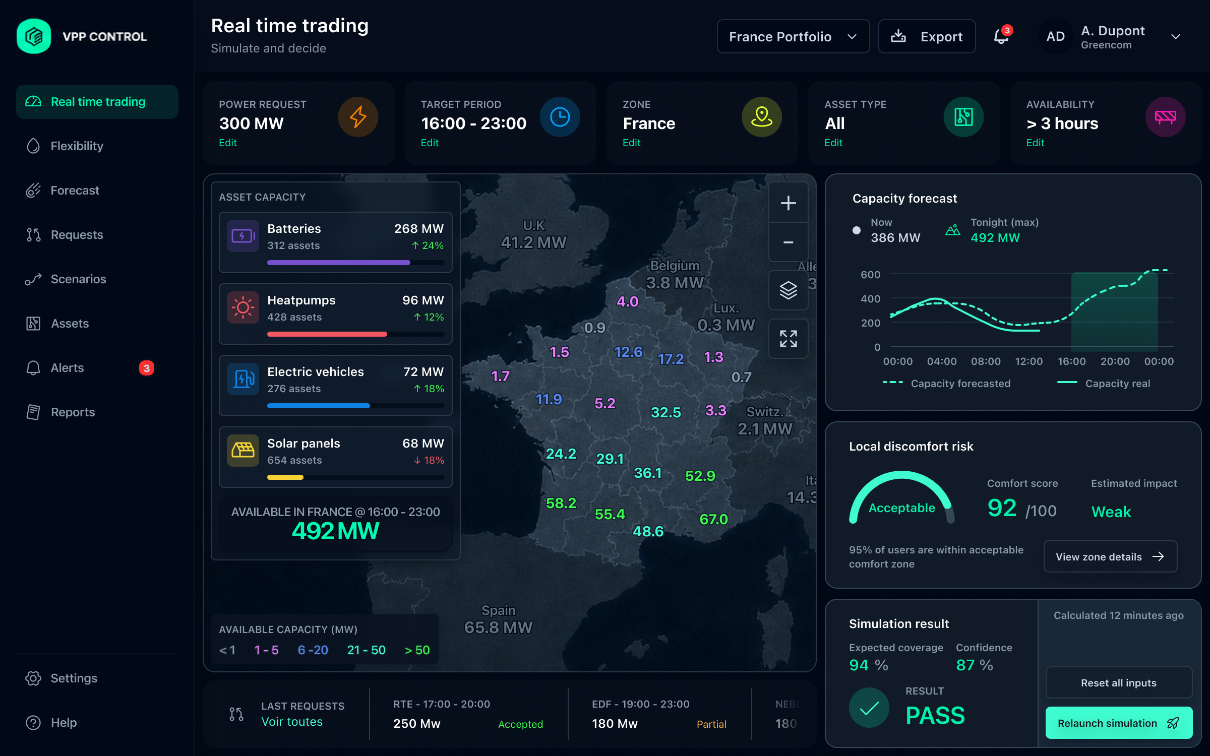
Comparison between a raw asset list and an after view directly showing power, availability, risk and simulation result.
Avoided cost
Accepted cost
Location
The map made the distribution of capacity visible before going into details.
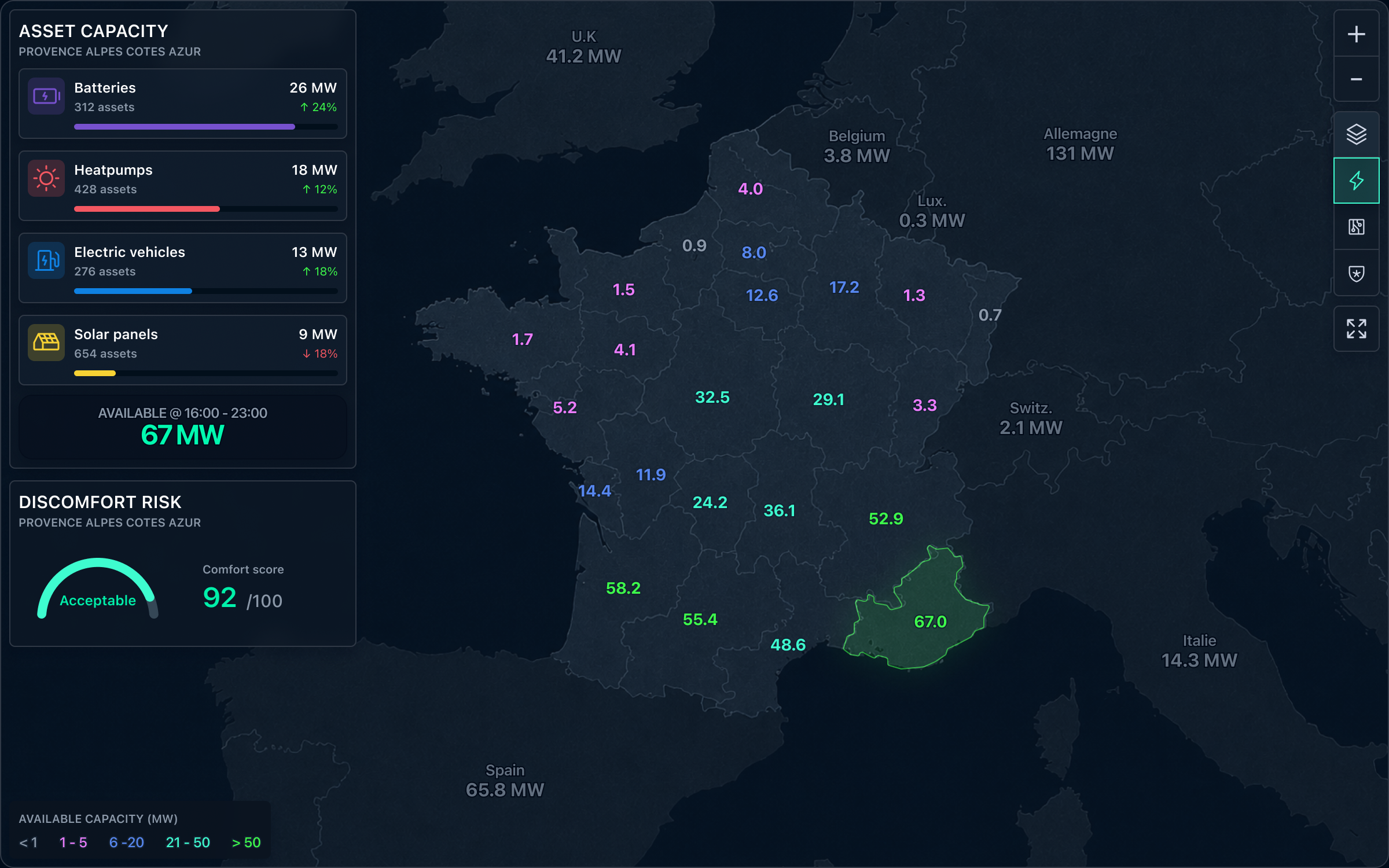
Map showing a selected zone of energy assets with available capacity highlighted.
Avoided cost
Accepted cost
Time
The decision had to distinguish currently available capacity from expected capacity during the target window.

Chart comparing currently available capacity and forecast capacity during the target period.
Avoided cost
Accepted cost
Action
Before using assets, the trader needed to test the demand and verify its feasibility.
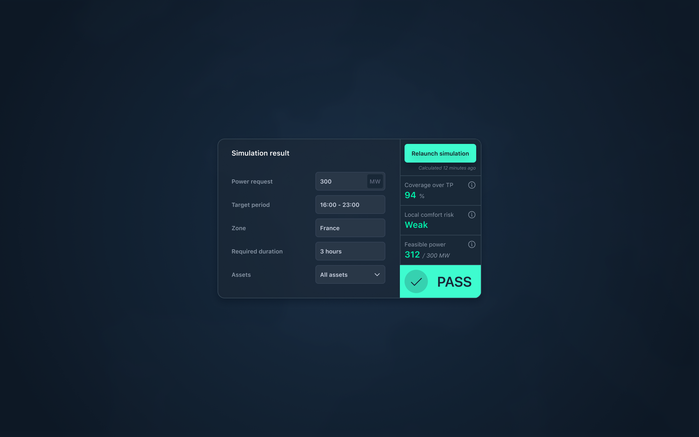
Simulation block showing requested power, target period, result, coverage and confidence.
Avoided cost
Accepted cost
The interface transformed slow searching through a raw list into fast reading of decision-ready answers.
Traders found usable energy faster
less line-by-line searching in the asset list
Available zones and units became more readable
production, storage and availability visible in a single view
Decisions required fewer manual cross-checks
more answers obtained directly from the interface
Time to get an answer
Before / After
The same questions became faster to answer.
Before
After
The new interface reduced manual cross-checking.
Show more data
DON'TTurn data into actionable answers
INSTEADSee visualisation as an end
DON'TUse it as an entry point for a decision
INSTEADHide uncertainty to simplify
DON'TMake it visible to decide with confidence
INSTEAD
