01
Friction
For users
Households did not have the same equipment, goals or level of energy understanding.
Very different equipment
Strong savings motivation
Variable understanding

In 2018, our product helped households equipped with solar, batteries or electric vehicles monitor their energy. I replaced a single, generic dashboard with a personalized experience based on the household profile, to make the data more useful and the value more visible.
Challenge
My role
OwnedContributedYear
Timeline
Tools
Methodology
Household energy profiles
Consumption
only
Solar
only
Solar +
bat.
Solar +
EV
Solar +
bat. + EV
Households did not all have the same equipment level.
Bounce rate
48%Share of sessions leaving the dashboard without interacting with its key elements.
Time spent on dashboard
41 secAverage time spent on the dashboard per user session.
The single dashboard did not hold attention well enough.
Retention over time
Interest dropped sharply after the first discovery.
Main motivation: savings
Households mostly consulted data that could explain concrete savings.
Interviews and engagement tests
How can we make the dashboard useful to different households primarily motivated by savings?
01
Friction
For users
Households did not have the same equipment, goals or level of energy understanding.
Very different equipment
Strong savings motivation
Variable understanding
02
Friction
For the business
The product value became hard to demonstrate with a dashboard that was too generic or too technical.
Value barely visible
Limited engagement
Difficult differentiation
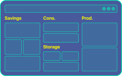
Organize by need
Create dedicated sections: save money, understand consumption and track production.
User language
Goals more visible
Fragmented overview
Not very suited to hybrid profiles
Personalize by profile
Generate a dashboard adapted to the household's equipment, goals and level of understanding.
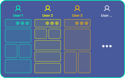
Immediate value
Needs better targeted
Sensitive configuration
Personalization to justify
Contextual progressive reveal
Keep one view, but progressively reveal the explanations and indicators that are useful.
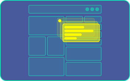
Less costly
Improves understanding
Limited personalization
Problem less targeted
Check out the 3 key decisions I made
Personalization
Because the same dashboard could not be useful to households with different equipment, motivations and levels of understanding.
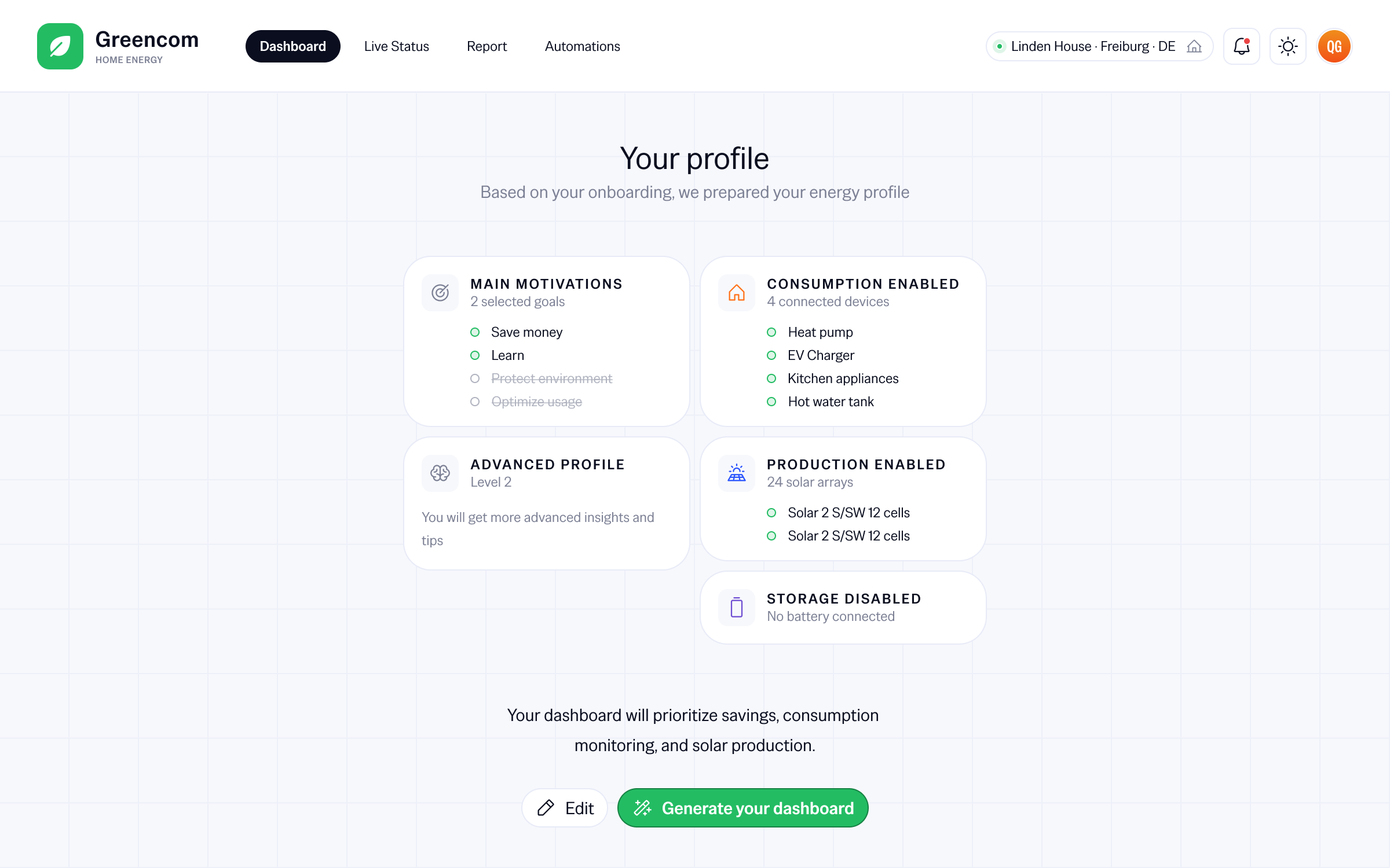
Energy profile generated from onboarding, with motivations, equipment and level of understanding.
Avoided cost
Accepted cost
Control
Because an initial profile could help at the start, but should not lock users into a frozen configuration.
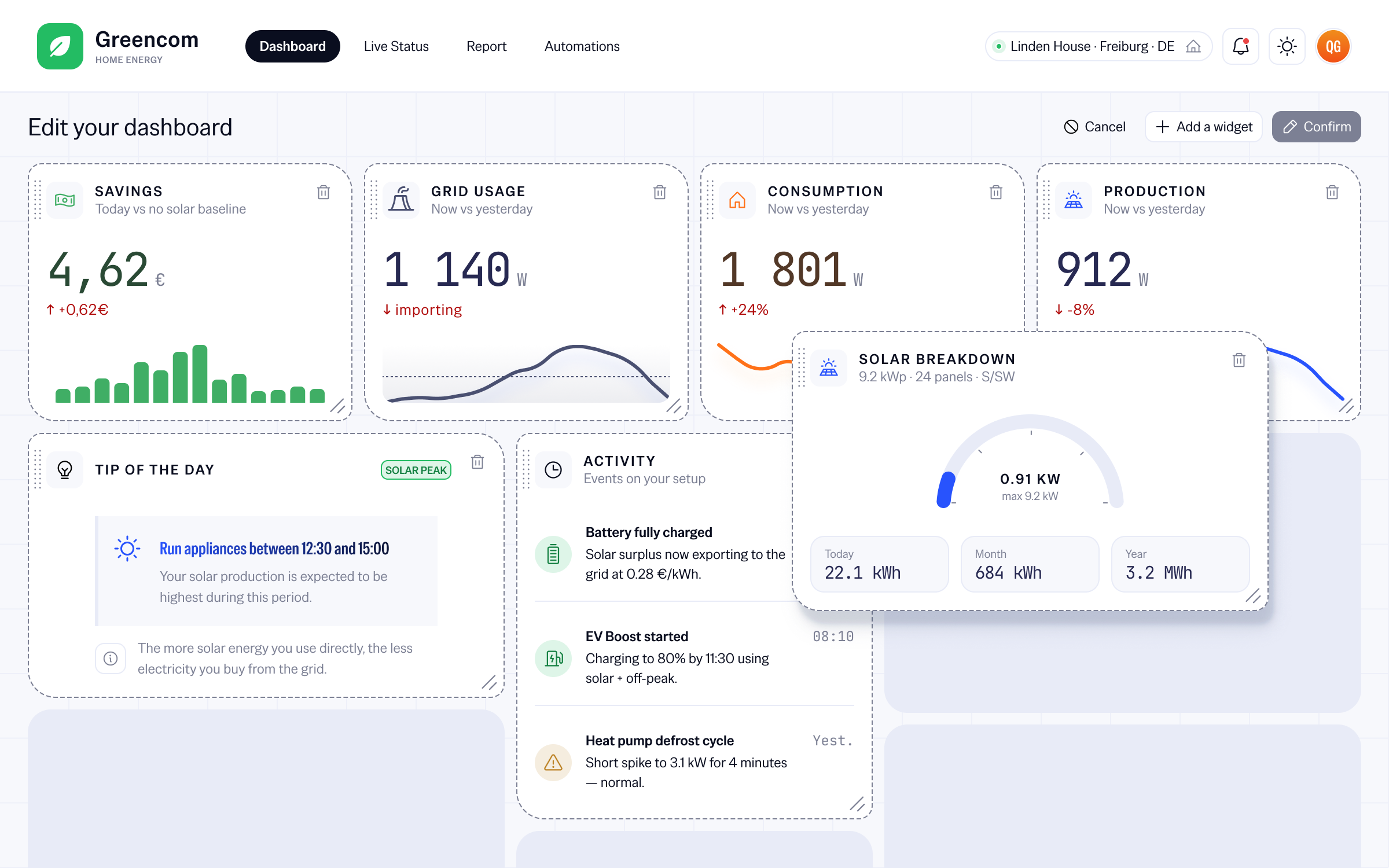
Edit mode allowing users to change the dashboard widgets.
Avoided cost
Accepted cost
Pedagogy
Because households were not looking for raw data, but for a clear explanation of their consumption and savings.
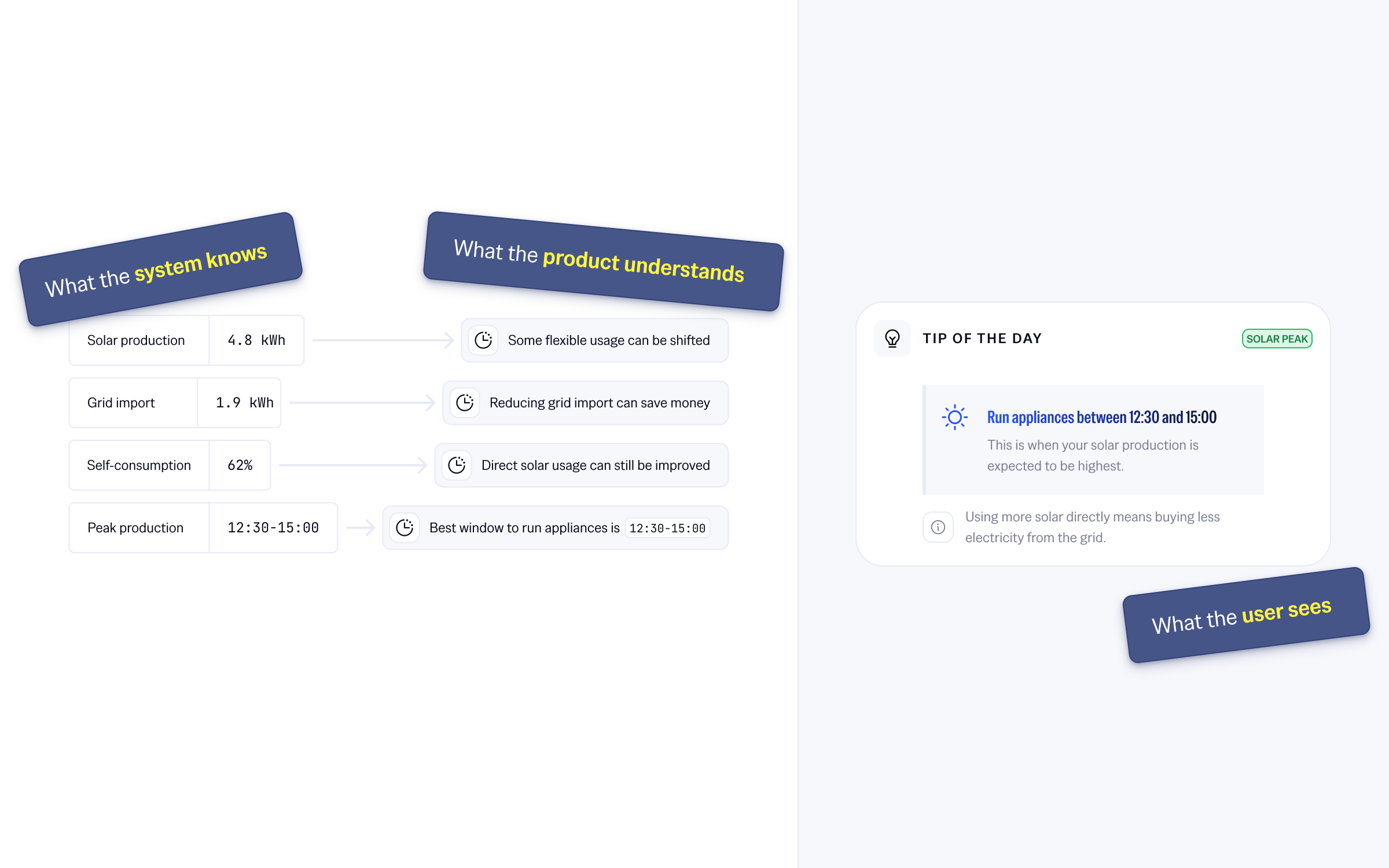
Transformation of raw energy data into understandable messages for the user.
Avoided cost
Accepted cost
Personalization improved the dashboard's key signals: initial attention, retention and perceived value.
The first visit became more relevant
with lower bounce and more time spent on the dashboard
Interest held better after discovery
with D7 and D30 retention increasing on personalized profiles
Value was better perceived
with savings-related modules consulted more often
Before
After
The dashboard held attention better from the first visit.
D7 retention
Before / After
More users came back after the first week.
D30 retention
Before / After
Interest held better after one month.
Module interactions
Before / After
Modules useful to the profile were consulted more often.
Design one view for everyone
DON'TAdapt the visible value to the user's context
INSTEADOrganize the interface around the product
DON'TOrganize it around what the user is trying to understand
INSTEADMeasure only global engagement
DON'TCompare signals by profile, module and usage moment
INSTEAD
