Problem - For energy traders
They had to quickly answer a simple question: how much energy can we use now or soon?
- Fast decision
- Variable availability
- Trust required
To know whether an energy demand was feasible, a trader had to juggle multiple tools and do the calculation themselves.
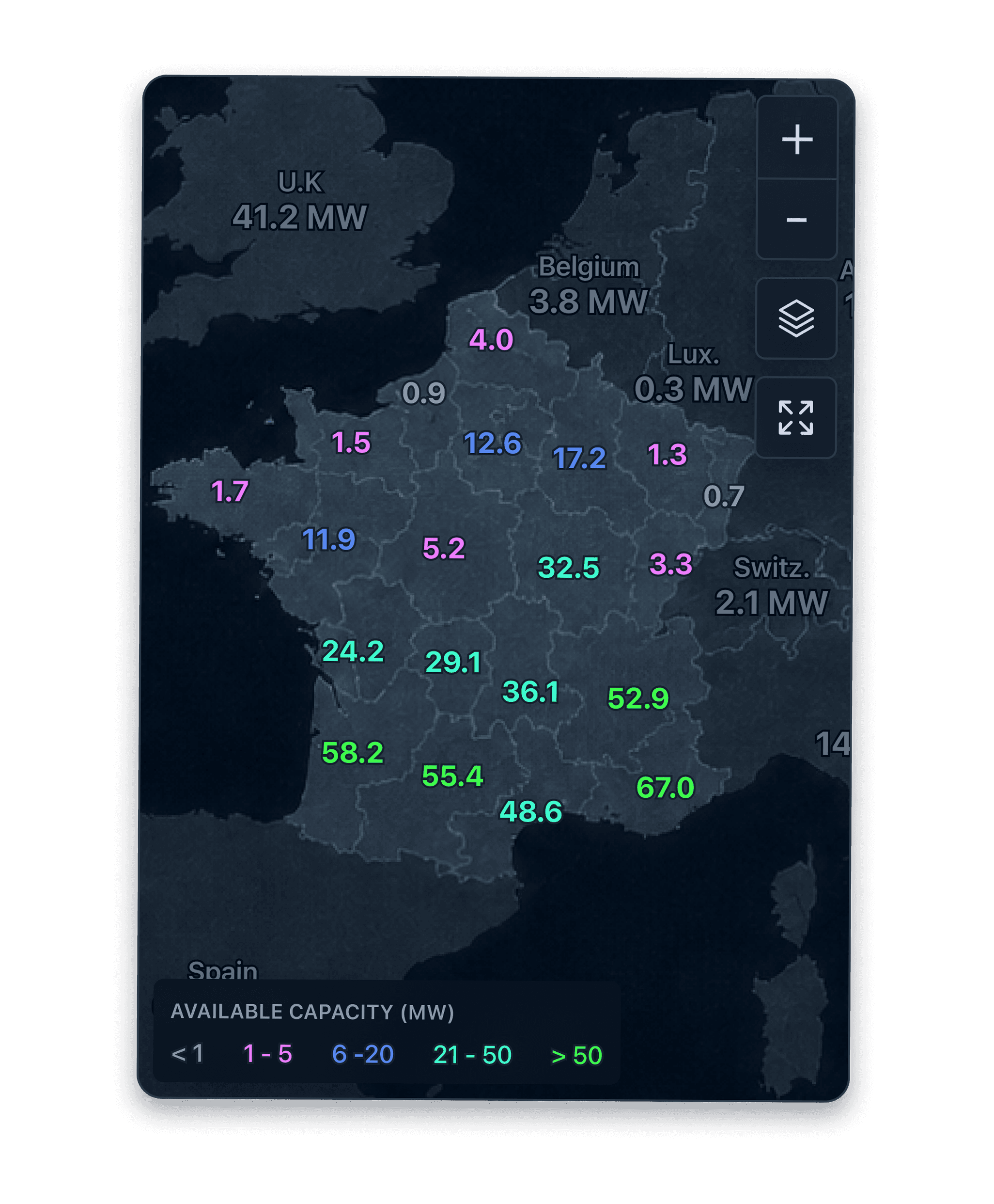
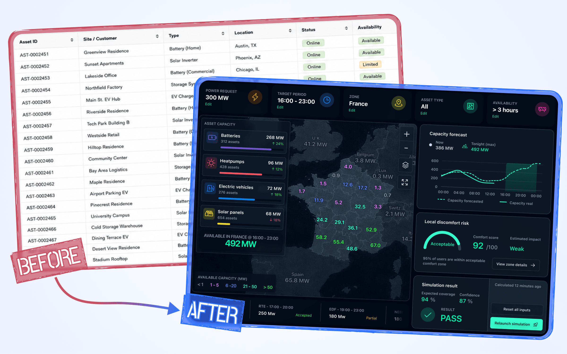
I designed an interface where available capacity, location and local risk were readable at a glance, and where you could simulate a demand before sending it.
I led
Team
Product - Engineering - Grand compte clients - Data Science
Challenge
Help traders quickly know how much energy can be used, where it is, and how long it remains available.
Year
2019
Timeline
9 months
Tools
Figma, Notion, Zeplin
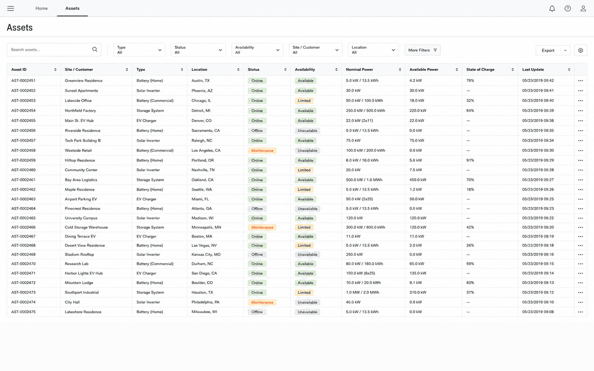
Problem - For energy traders
They had to quickly answer a simple question: how much energy can we use now or soon?
Add filters, statuses and key columns to find available assets faster.
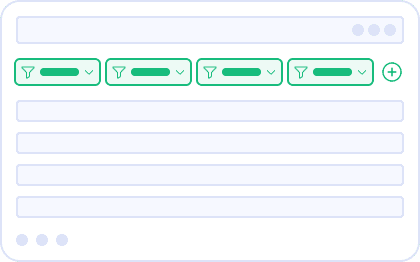
Promise
Quick to ship / Familiar usage
Reasons for dropping
Answer still to reassemble / Decision still slow
Display assets on a map to understand where available energy is located.
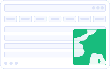
Promise
Clear localisation / More readable portfolio
Reasons for dropping
Observation view only / No simulation
Combine map, capacity, forecast, local risk and simulation in a single interface.
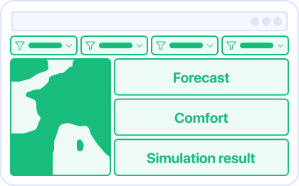
Promise
Immediate answer / Testable action
Accepted risk
More complex / Thresholds to explain
Because an asset list forced traders to search, compare and recalculate before they could decide.
Avoided cost
Line-by-line searching
Avoided cost
Answer to reassemble manually
Prioritising the answers
Accepted cost
Hiding secondary details
Accepted cost
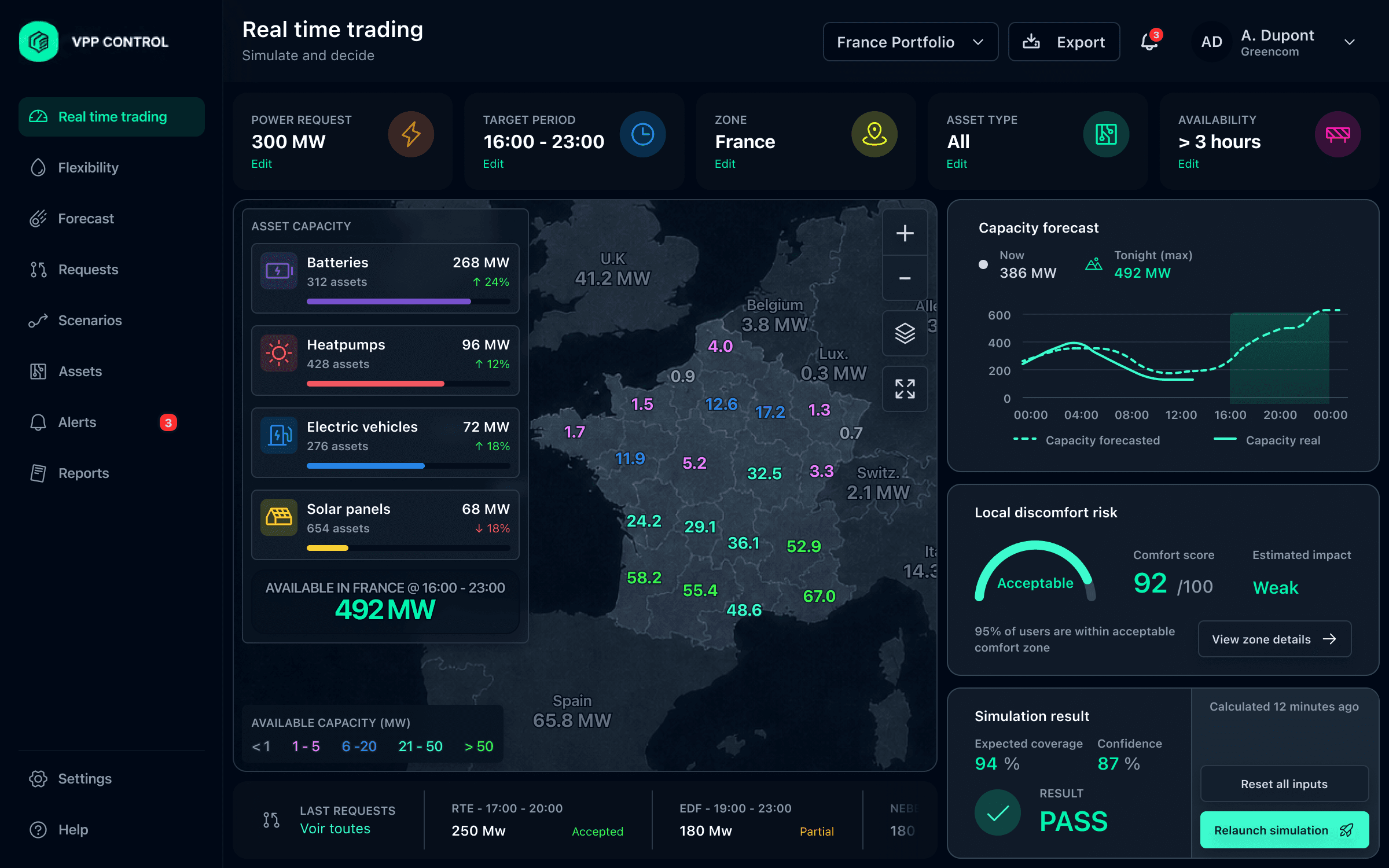
Because available capacity did not have the same value depending on its zone, density and local impact.
Avoided cost
Invisible capacity by zone
Avoided cost
Slow geographic comparison
Map to make readable
Accepted cost
Filters to prioritise
Accepted cost
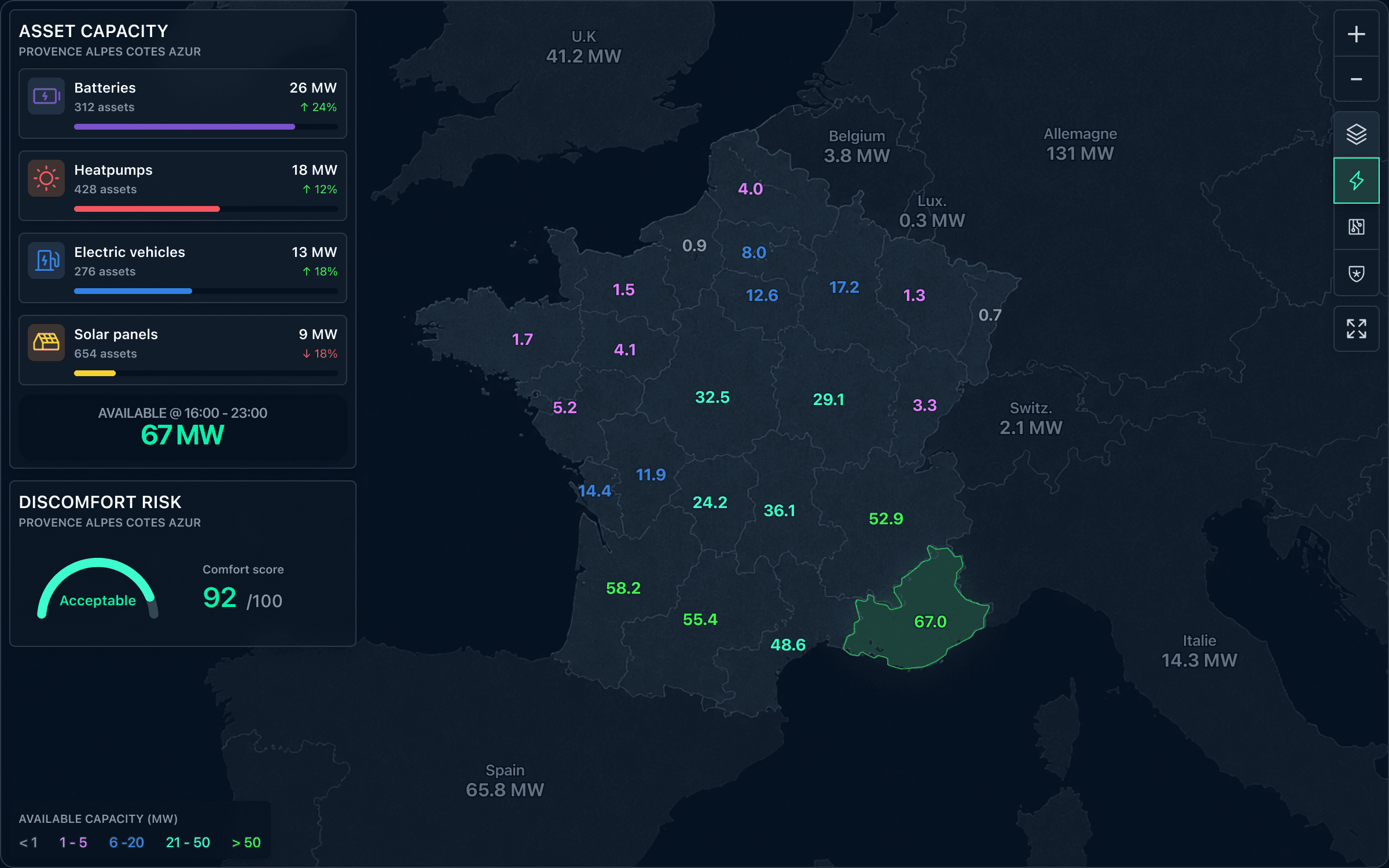
Because capacity available now could disappear before the period actually requested.
Avoided cost
Too instantaneous a decision
Avoided cost
Poorly anticipated availability
Displaying uncertainty
Accepted cost
Explaining the forecast
Accepted cost
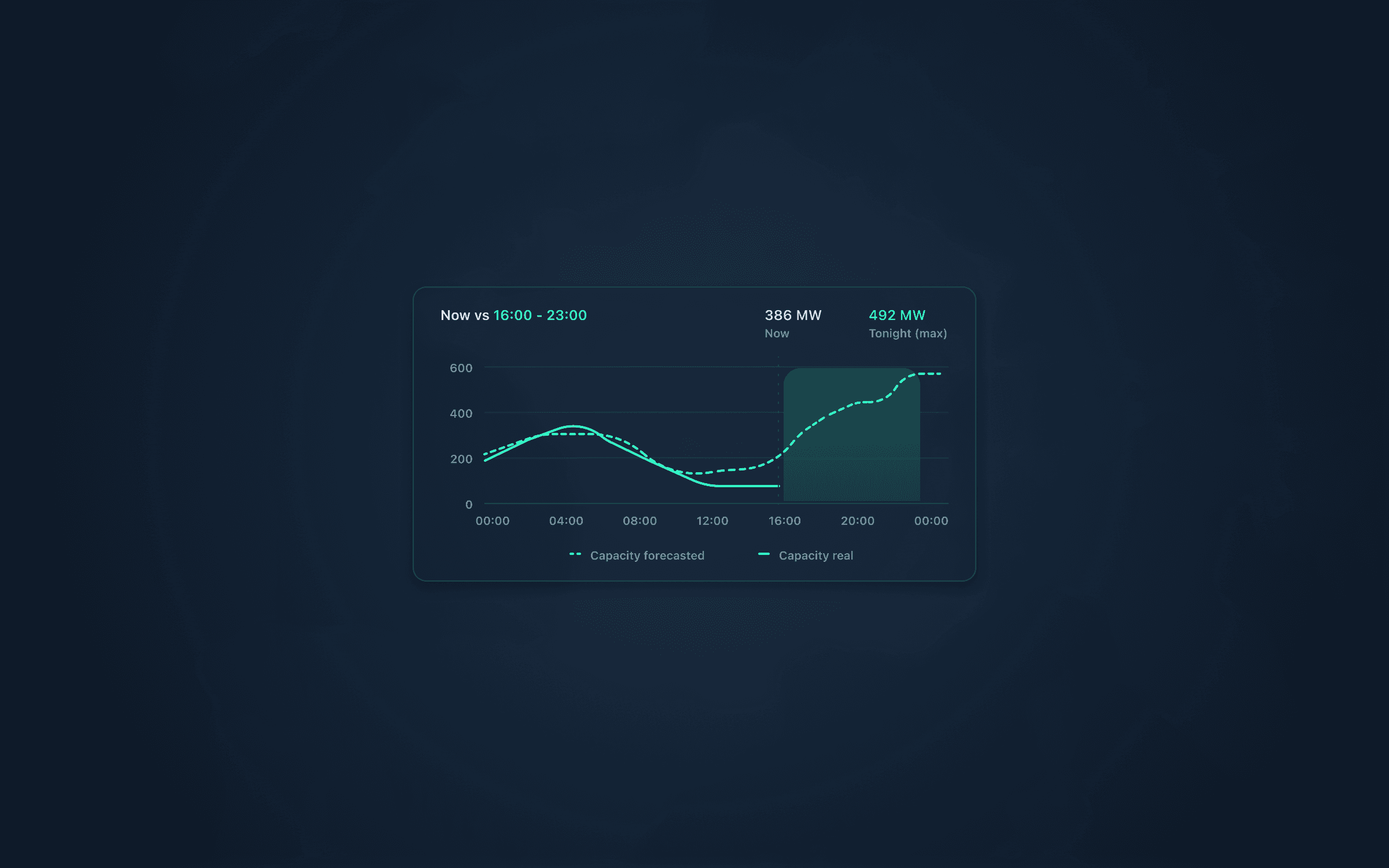
Because committing a demand without testing it could exceed real capacity or degrade local comfort.
Avoided cost
Too risky a commitment
Avoided cost
Underestimated local impact
Constraints to model
Accepted cost
Limits to display
Accepted cost
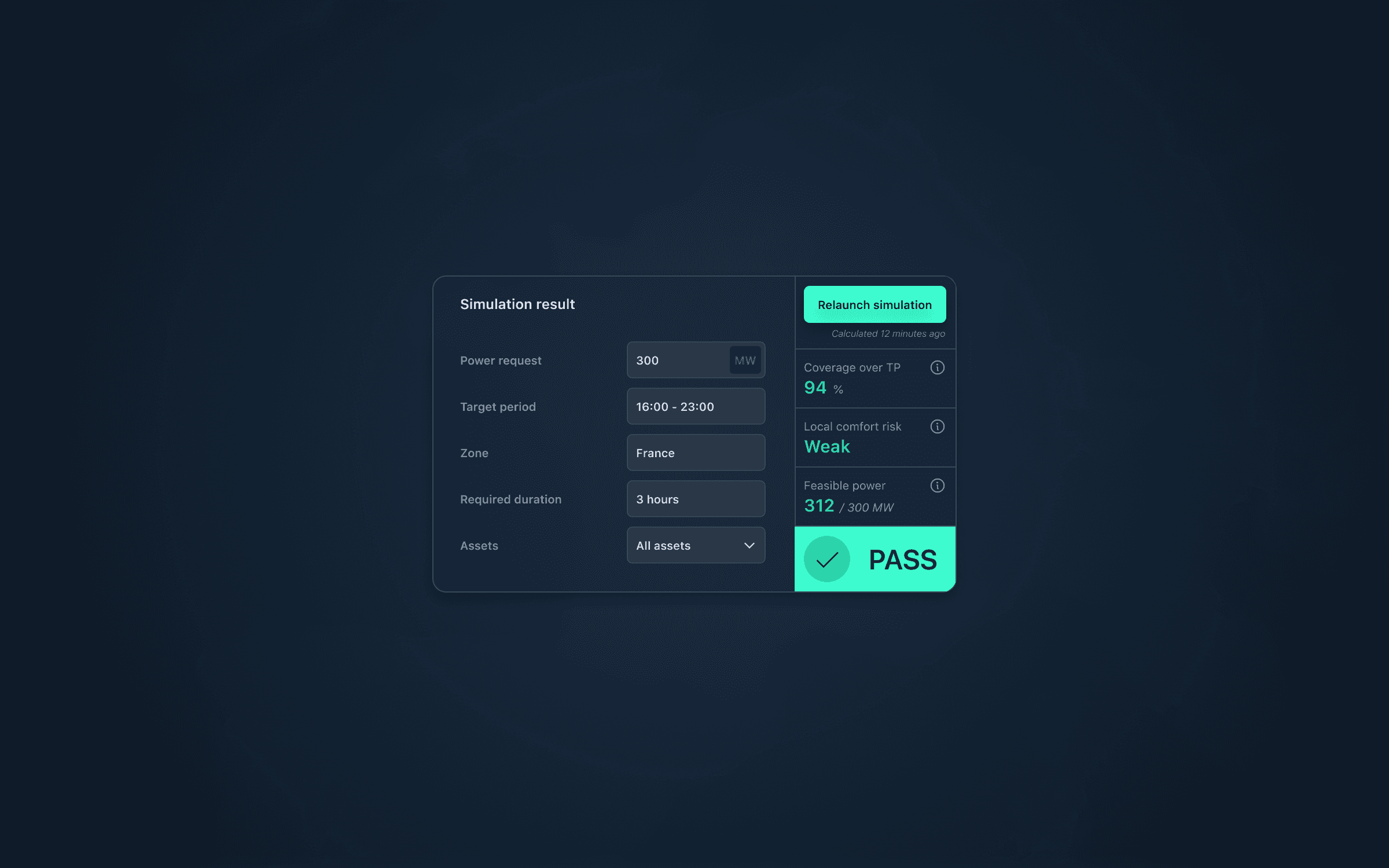
The interface transformed slow searching through a raw list into fast reading of decision-ready answers.
Traders found usable energy faster
less line-by-line searching in the asset list
Available zones and units became more readable
production, storage and availability visible in a single view
Decisions required fewer manual cross-checks
more answers obtained directly from the interface
The same questions became faster to answer, on tested paths.
The new interface reduced manual cross-checking.
Answers obtained without interaction
Answers requiring manual analysis
Show more data
Turn data into actionable answers
See visualisation as an end
Use it as an entry point for a decision
Hide uncertainty to simplify
Make it visible to decide with confidence