Problem - Household users
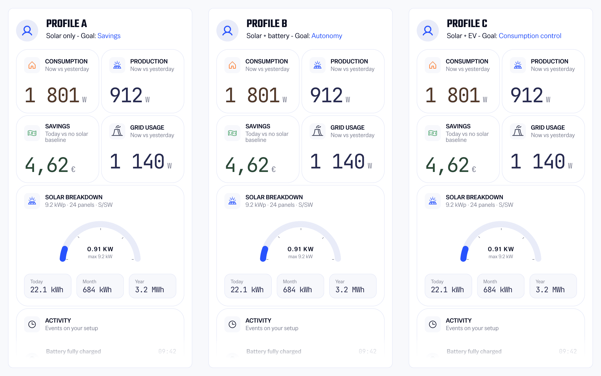
Households did not have the same equipment, goals or level of energy understanding.
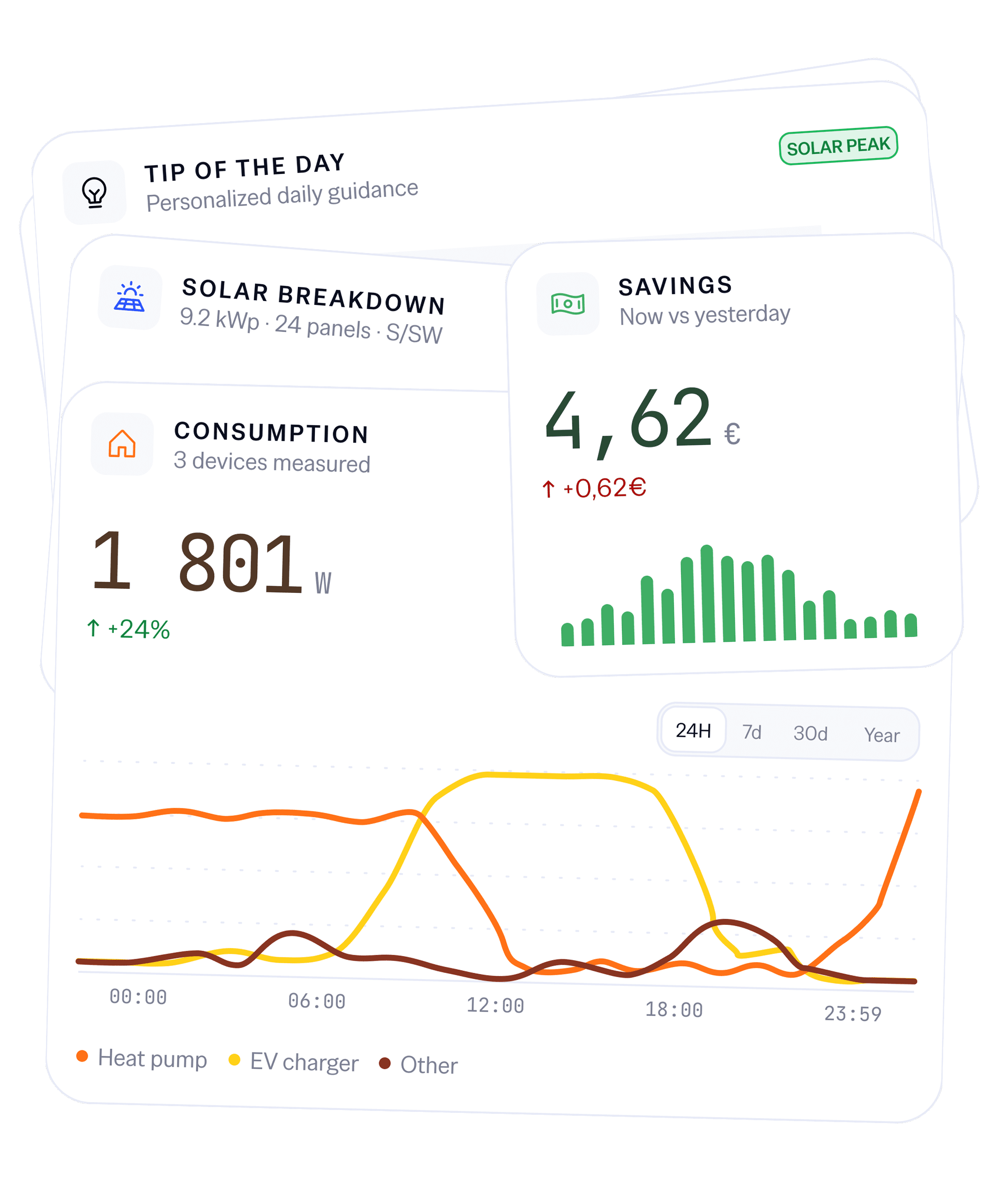
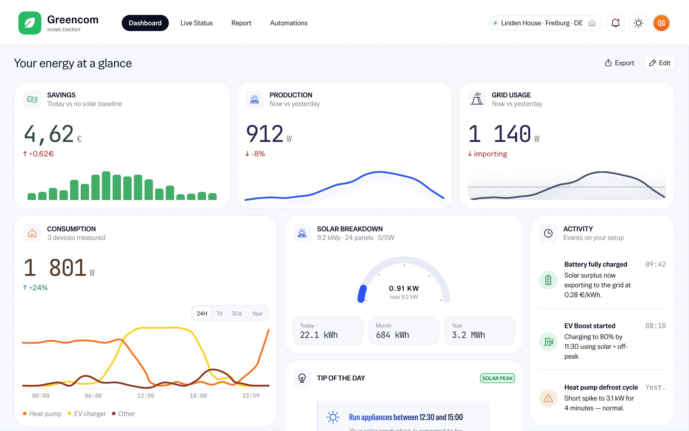
We were offering the same dashboard to all households, whether they had a solar panel, a battery or just a socket.
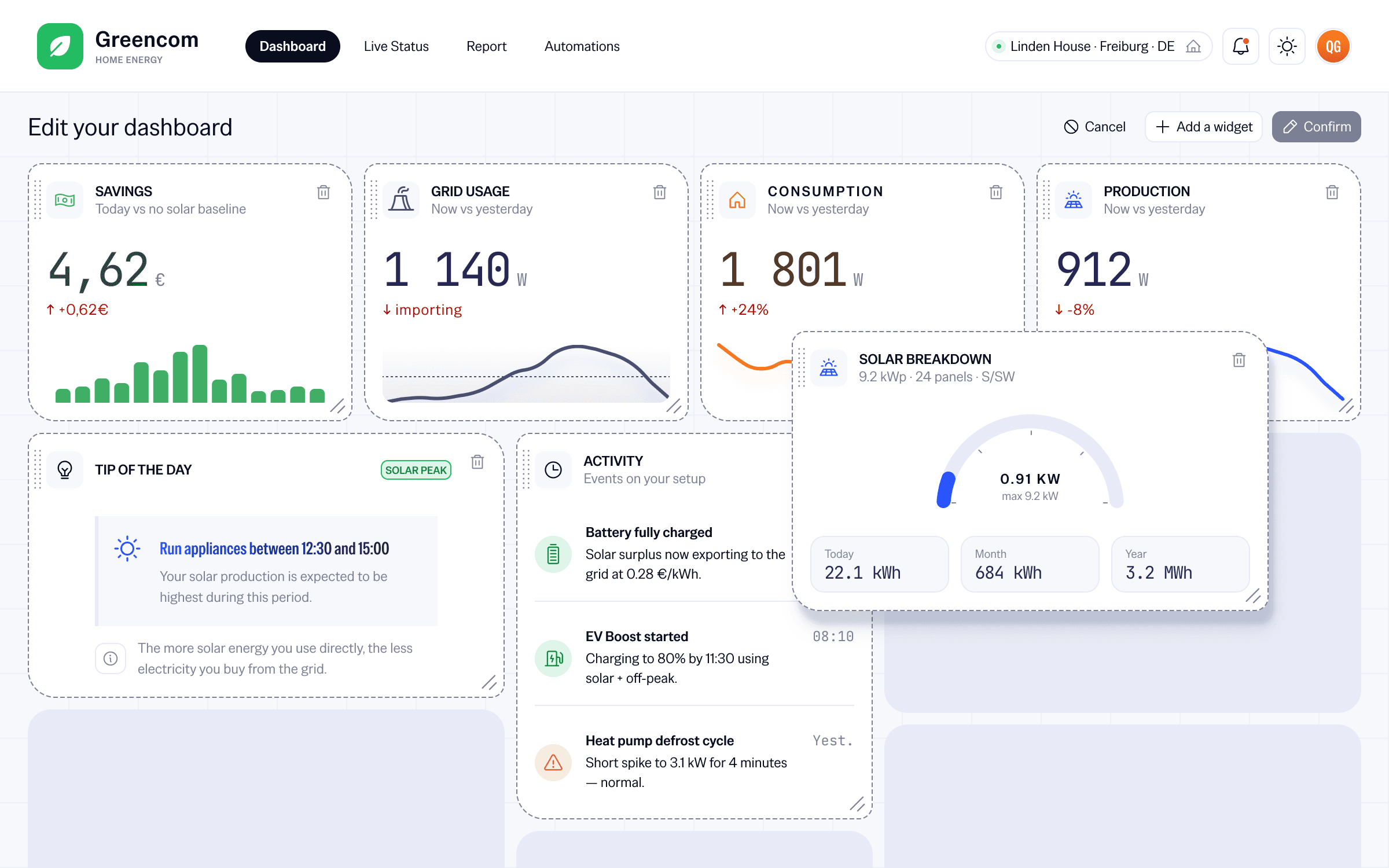
I built an experience that adapted to each household's profile: equipment, goals and level of understanding, so that the displayed data would make sense to the person reading it.
I led
Team
Product - Engineering - Grand compte clients - Sales
Challenge
Make energy data useful to every household, whatever their equipment or level of understanding.
Year
2018
Timeline
4 months
Tools
Figma, Notion, Storybook, Zeplin, Illustrator
Problem - Household users
Households did not have the same equipment, goals or level of energy understanding.
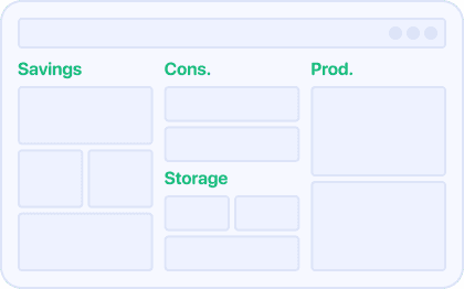
Create dedicated sections: save, understand consumption and track production
Promise
User language and goals more visible
Reasons for dropping
Some intentions were still not resolved
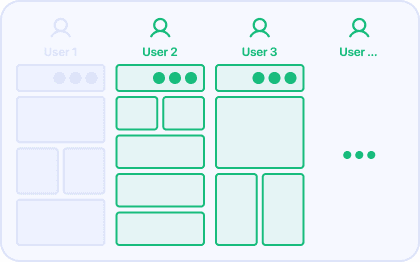
Generate a dashboard adapted to the household's equipment, goals and level of understanding
Promise
Response adapted to every household
Accepted risk
A more rigorous onboarding to design
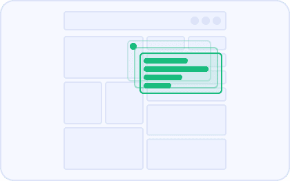
Keep a single view, but progressively reveal useful explanations and indicators
Promise
Quick to set up and non-invasive
Reasons for dropping
It solves comprehension levels but not setup differences
Because the same dashboard could not be useful to households with different equipment, motivations and levels of understanding.
Avoided cost
A view that was too generic
Avoided cost
Modules that were not very useful
A profile to explain
Accepted cost
Variants to maintain
Accepted cost
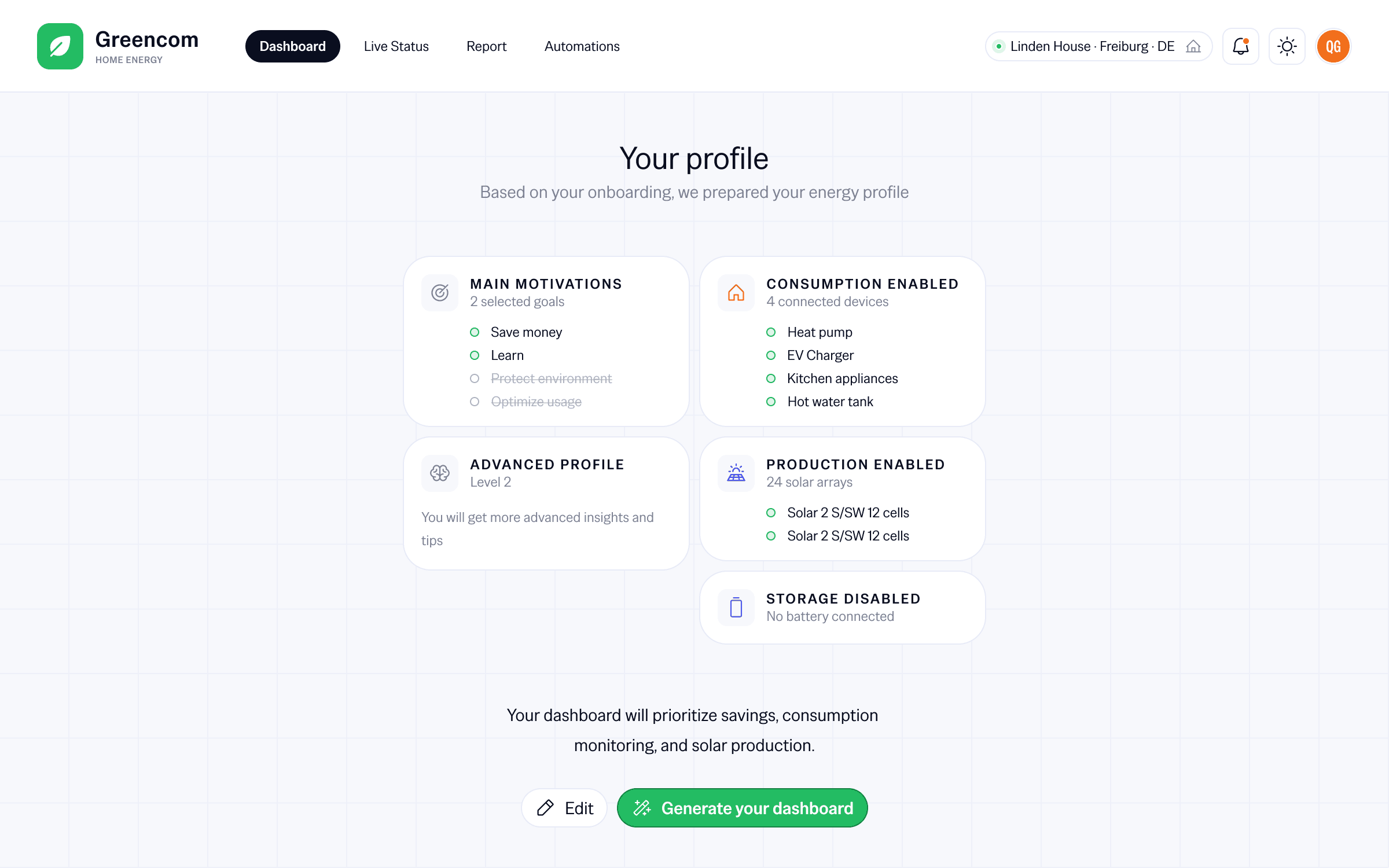
Because an initial profile could help at the start, but should not lock users into a frozen configuration.
Avoided cost
Frozen personalization
Avoided cost
Needs poorly covered
More interface states
Accepted cost
More complex logic
Accepted cost
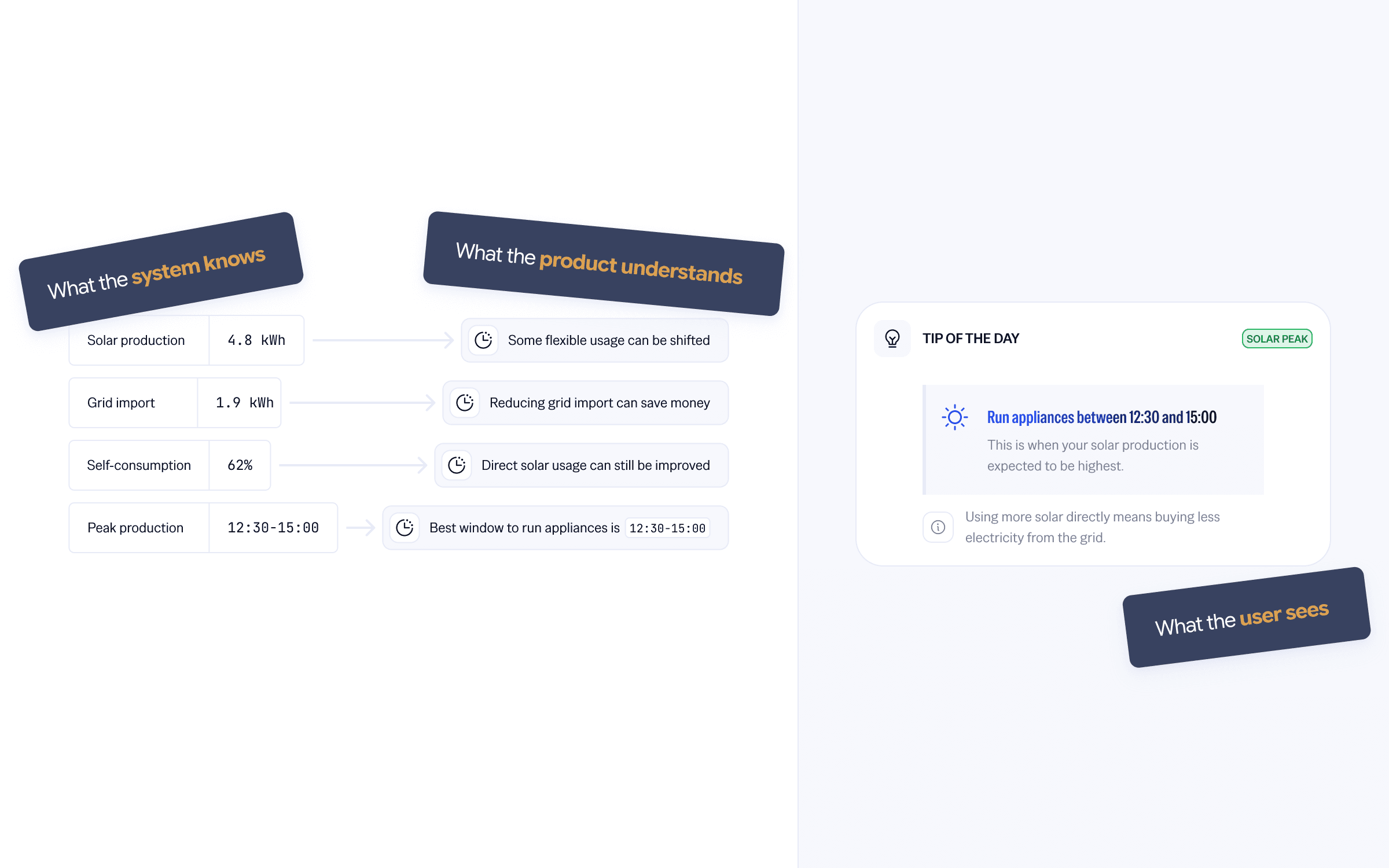
Because households were not looking for raw data, but for a clear explanation of their consumption and savings.
Avoided cost
Data that was not understood
Avoided cost
Value that was not visible enough
More UX writing
Accepted cost
Levels to manage
Accepted cost
Personalization improved the dashboard's key signals: initial attention, retention and understanding of value.
The first visit became more relevant
with lower bounce and more time spent on the dashboard
Interest held better after discovery
with D7 and D30 retention increasing on personalized profiles
Value was better perceived
with savings-related modules consulted more often
The dashboard held attention better from the first visit.
Bounce rate
Time on dashboard
More users came back after the first week.
D7 retention
Personalized profiles maintained interest better after one month.
D30 retention
Modules useful to the profile were consulted more often.
Module interactions
Design one view for everyone
Adapt the visible value to the user's context
Organize the interface around the product
Organize it around what the user is trying to understand
Measure only global engagement
Compare signals by profile, module and usage moment